The Page Layout Stage allows build ready plans to be laid out before printing. You are given a drawing area that matches your chosen paper size.
The stage is based on Pages and Layers. Each page can contain multiple layers, each customized with the necessary information and images.
Plans can consist of multiple pages each specified to your needs. Layers, pages and other elements created in construction can be saved in the Construction Library.
Page Layout Overview Video 🎥
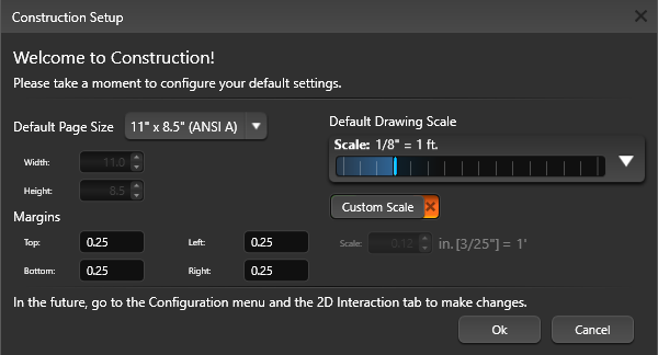
Welcome to Construction!
When you first enter construction you can configure your default settings.
To access this menu again go to the 2D Interaction tab on the Configuration menu. Click the Change Construction Page Defaults button.
The Page System
Each Page of the construction plan may contain many layers and each layer may contain any type of object.
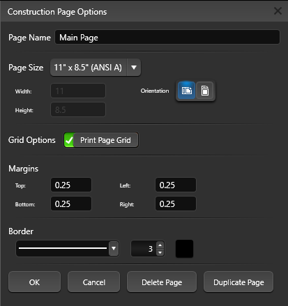
Changing Page Size: The Gear icon to the right of the active page tab allows you to edit the properties of an existing page. When you press the Configure button, the Construction Page Options box will come up. This box will display the current settings. You can change the page name, page size, orientation, grid options or margins. Press the Save button when you are done.
Grid Options: To print the division grid on your page, add a green check to Print Page Grid.
Margins: Margins are the blank spaces that line the top, bottom, and left and right sides of a document. To set the margins enter values in the fields next to Top, Bottom, Left, and Right.
Border: Add a border to your page and set the line style and thickness.
Adding Pages
To create a new page, click the New Page button located at the bottom of the virtual paper. Clicking the New Page button will bring up the Construction Page Options box.
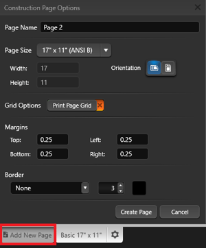
Give the page a name and select the page size from the drop-down. To create a custom page size or margins, select Custom from the Page Size drop down menu, then type in the Width and Height.
Set the page orientation, check Grid Options to print the construction grid on the page, set the margin size and add a border.
Press Create Page when you are done.
Re-Order Pages: To change the order of the pages, click and drag the page tab at the bottom of the screen.
NOTE: Only one page may be viewed at a time. To switch page views, left click the page in the Page tab.
Page Layout Grid
Create uniform pages with the construction grid. When the grid is active, objects and text will snap to the grid as they are moved or resized, making it easy to line up all the content on the page.
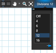 Division Drop-down: Add a grid to your page. The Division number determines how many grid segments are on the page, with each square representing one division of the page.
Print: To print the grid, Click on the gear at the top of your page and choose the Print Page Grid option.
To freely move around while still being able to see the grid, you can disable Grid Snap in the Snaps Menu.
Using a Page Template to Create a New Page
In the Construction Library, select the Pages Category. A list of page templates will appear in the List View and a preview of the selected pages will appear in the Thumbnails Panel. Page templates will insert with all attached page settings.
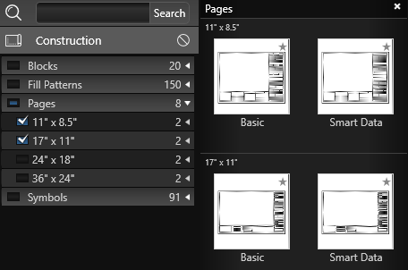
Templates from the list will create a new page by double left clicking on the name or preview picture. To insert a selected template into your current page, left click the Insert button. Inserted template pages will default to a generic name, click the Configure icon on the active page tab to rename it.
Saving Pages as Templates
Click off the virtual paper (in the dark gray space) to clear your selection. Make sure nothing is selected in your viewport and press the Save button.
The Create New Template box will come up and display a preview image of your template. Select the Category and Type you would like the template saved to from the drop-down lists and give your template a Name.
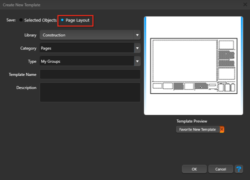
Press the Ok button when done.
NOTE: It is very important that you choose “Page Layout” at the top.
The Layer System
The Page Layout Stage is based on a Page and Layer System. Each Page can contain many layers, and each layer may contain any type of object. Layers may contain 2D views of the design, text, symbols, images, and other necessary information. Each layer or page may be individually edited. Objects or groups of objects may be saved in the library.
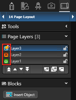 Pencil: This icon will appear next to the layer you are currently editing, the active layer. Any new lines or objects added to the 2D Viewport will be assigned to your active layer. If you need to move a line or object from one layer to another, copy it (Ctrl+C) click on the desired layer and paste (Ctrl+V). A layer must be active to edit it.
Green Eye: This icon will appear next to visible layers. A layer must be visible to edit it.
Orange X: This icon will appear next to hidden layers. Selecting a hidden layer will make it active and unhide its contents.
Layer Controls
The main Layer System controls are located under the Page Layout Tab in the Panel. By default, a new project will have one layer. Left clicking the arrow to the right of the Layers tab will collapse the listed layers.
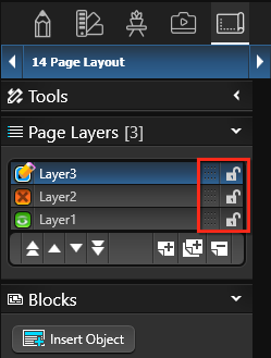 Lock: The Lock icon to the right of each layer signifies if the layer is editable. An open lock signifies the layer can be edited. A closed lock signifies the layer cannot be edited and nothing on the layer can be selected.
Locking a layer is useful for layers that contain information that does not change from project to project like company information. It’s a good practice to lock layers as you complete work on them to avoid mistakes.
Drag: The Drag Layer icon (small dots) to the left of each Lock icon allows you to change the stack order. Hold down the left mouse button and drag the layer up and down to change the stacking order of the layer list.
Layer Stack Order
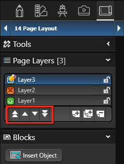 You can change the stacking order of the layers by dragging the layers up or down the list or pressing one of the four Stack buttons in the bottom left of the layers panel. The Stack buttons allow you to alter the stacking order of layers.
Double Up Arrows: Move selected layer to top of visual stack.
Up Arrow: Move selected layer up one position in visual stack.
Down Arrow: Move selected layer down one position in the visual stack.
Double Down Arrow: Move selected layer to bottom of visual stack.
Add, Duplicate and Remove a Layer
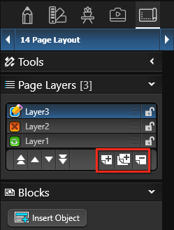 The buttons located at the bottom of the Layers list allow you to create a new layer, duplicate an existing layer and remove an existing layer.
Create New Layer: The New button adds a new layer to the list.
Duplicate Existing Layer: The Duplicate button creates copies of selected layers. Duplicating a layer also duplicates all objects on the layer.
Remove Existing Layer: The Delete button Remove will remove a layer from the Layers list.
Creating New Object Types
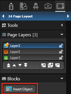
New object types are created by clicking the Insert New Object button located under the layer list in the panel.
Insert Object: Clicking the Insert New Object button will bring up the Insert New Object box.
Name: The name field allows you to give your newly inserted Object a name
Once you have inserted a new object type, you may move it with the move tool. The object will automatically snap to the edge of the page.
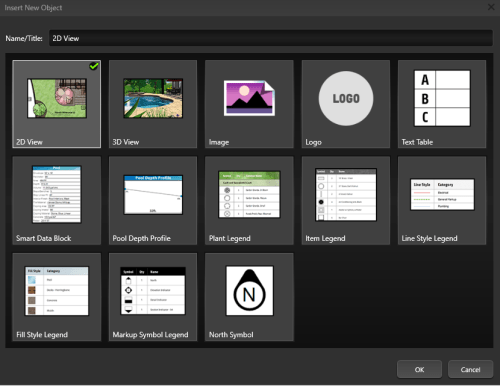
2D View: The 2D view is created with a view of your design in 2D. The shapes generated with 2D View may not be edited or selected. 2D Views automatically update if you return to previous stages and edit the design. Selecting 2D View and pressing OK will bring up the 2D Drawing Options dialog box.
Here you can choose the layers you want to the newly inserted 2D view to display. You will see the layers from Construction Markup. You may select or deselect the layers you would like displayed. If you need to print your 2D view with a grid click on Print Grid and choose your Grid Spacing. You also have individual control over your symbol style on each individual 2D View. You may keep your default Symbol preference from design stages or force all landscaping and items to 2D Symbols or 3D Markers.
3D View: The 3D View creates a locked view of the project in 3D. Any Locations created in Photo Mode will appear as default angles to choose from when inserting the 3D View. More than a screenshot, the view can be adjusted once inserted. Double click on the 3D View to adjust the angle. Use left click or arrow keys to rotate the view, right click to zoom in and out, center mouse click to pan the view, and adjust the time of day with CTRL plus arrow keys, or N.
Image: Images of your 3D design and elements such as company logos may be added by selecting the 2D image option. This will bring up a file selection box. Graphic files in the .BMP, .PNG, .JPG, .TGA, or PDF formats may be added to your layout.
Logo: Your logo may be added by selecting the Logo option. If your logo is already added to the Project Information screen, it will automatically be selected. If no logo is present, this will bring up a file selection box. Graphic files in the .BMP, .PNG, .JPG, or .TGA formats may be added to your layout. The new logo will automatically be added to the Project Information screen.
Text Table: Add a table of text to construction sheets. Whether you need just a couple of lines or a large table, you can easily choose exactly how many columns and rows to add to the new table. Then, just grab the corner handles to resize it to fit the page.
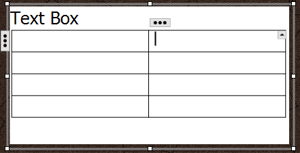 With a cell selected in the Text Table, click the 3 dots to add additional rows or columns.
Click the up arrow to select individual cell borders. Once selected, they can be adjusted on the Line tab under Object Styles.
To merge cells, press and hold Shift on the keyboard, then left click on additional cells to select them. Click the up arrow and then Merge Cells. Select any merged cell, then the up arrow to Unmerge cells.
Smart Data Block (Vip3D Only): The Smart Data Block allows you to display automatic detailed calculations for your projects. This includes Turn Downs, Step Risers, Dirt Displacement, Concrete Yardage, Rebar, and more. When you create the block you can choose which types of data will be displayed.
NOTE: Smart Data Blocks update automatically as you make changes to your design.
Pool Depth Profile (Pool Studio and Vip3D Only): The Pool Depth Profile creates a copy of the pool depth profile.
Plant Legend: The Plant Legend allows you to automatically display a symbol legend listing plants and trees inserted into your design. When you create the legend you can choose which types plants and trees will be displayed.
Item Legend: The Item Legend allows you to automatically display a symbol legend listing library items inserted into your design. When you create the legend you can choose which types of items will be displayed. This allows you to create separate legends for items, lighting, and irrigation.
Line Style Legend: The Line Style Legend allows you to automatically display the Line styles and assigned category.
Fill Style Legend: The Fill Style Legend allows you to automatically display the fill styles and assigned category.
Markup Symbol Legend: The Markup Symbol Legend allows you to automatically display markup symbols, quantity and name of symbol.
NOTE: All legends update automatically as you make changes to your design.
North Symbol: The North Symbol will automatically match the Orientation set in Stage 1: Project Information. To add a custom North Symbol, create the symbol in Construction Markup and save as a template to the Symbols > North Symbols category.
Object Settings
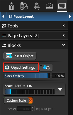
The Object Settings button allows you to change settings of an inserted object. Simply select an already created object with the move tool. Once the object is selected, click the Object Settings button.
You can edit the 2D View, 3D View, Smart Data Blocks, Plant Legends, Item Legends, Line Style Legends, Fill Style Legends and Markup Symbol Legends.
Editing the 2D View
The 2D Drawing Options box will come up and display a list of your markup categories. You select the Categories you would like to appear and can change other properties of the object.
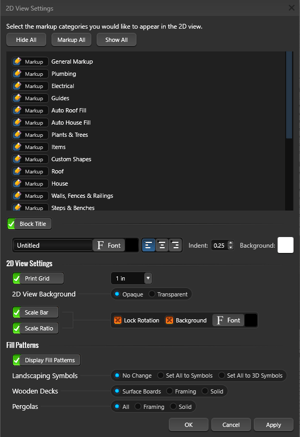 Markup Category Options:
- If the box next to the Category displays a Markup Pencil, it will use the Hide/Unhide settings from the previous stages.
- If the box displays a Green Eye, everything on that layer will appear.
- If the box displays a Red X, everything on that layer will be hidden.
Background Images Options:
- 2D View Background: Select Opaque to have a solid white background. Select Transparent to have remove the white background so the entire view inside the border is transparent.
- Show GIS: When checked, the GIS image will be displayed.
Fill Patterns Options:
- Show Fill Patterns: When checked, fill patterns will be displayed.
- Also set the appearance for Landscaping Symbols, Wooden Decks and Pergolas.
Display Legend Options:
- Show Scale Bar (Vip3D Only): When checked, a Scale bar for the 2D View will be displayed in the bottom right.
- Show Scale Ratio: When checked, the Scale for the 2D View will be displayed in the bottom right. Use the Font controls to the adjust the appearance of the Scale.
- Lock Rotation: When checked, the scale bar and ratio will remain locked in the bottom right corner when the 2D View is rotated.
- Background: When checked, the scale bar and ratio have a white background.
Press the Ok button when done.
Editing the Legends
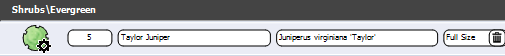
The Plant Legend displays the symbol, quantity, common name, botanical name, and container size for plants and trees inserted into the design.
Changes to the Design: The legend lists the actual items inserted into your design. If changes are made to the design, the legend will automatically update item quantity and remove items that have been deleted.
Automatically Update Quantity based on Hide/Unhide Settings: With this box checked, the Legend does not display plants/trees hidden in earlier stages. Uncheck the box to display all plants/trees on the Legend, even if hidden in earlier stages.
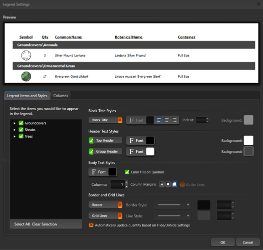
Manual Changes to the Legend: The information listed on the legend may also be changed manually. Simply left click on the item and it will become a text field you can edit. This allows you to enter the common names you use or change the quantity to reflect actual build amounts.
2D View Scale and Position
Every 2D View added to the virtual paper can have its own scale. You can Pan the 2D View and set a specific Scale for your printed 2D View.
Pan: The 2D View Pan Tool is represented by a hand icon with four way arrows. Pressing this button will change your cursor to a hand. Holding down the left mouse button and dragging with the 2D View Pan Tool will allow you to pan your view within the 2D View. The 2D View Pan Tool is used to move your design within 2D view and set specific views.
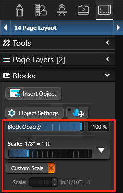
Block Opacity: Opacity is the extent to which something blocks light. You can change the opacity of 2D View, 3D View, Image, and Logo objects so that more or less of the underlying image or view shows through.
TIP: The Opacity Slider offers an incredibly beautiful and interactive way to show your clients a before-and-after view, highlight a feature or set your logo as a watermark.
Scale: This slider changes the scale of the 2D View. The scale may be changed by moving the slider or left clicking on the down arrow and selecting a specific standard or engineering scale from the menu.
Custom Scale: Selecting Custom Scale will bring up the Custom Scale box where you may enter a custom scale for the active 2D View.
Zoom to Fit: Zoom to Fit centers and scales the 2D view on all visible layers from your design stage objects.
When active this will automatically turn on Custom Scale and set the scale to the appropriate number. The Zoom to Fit tool is used to set specific views in secondary 2D views.
Drawing New Shapes
 New shapes may be drawn and edited using the line, arc, and other tools. Complete and incomplete shapes may be drawn in this stage.
These shapes will not appear in the 2D view of design stages or in any 3D view.
You can create new lines and objects over and around your 2D view. These lines will not have the same scale as your 2D view but they are important for calling attention to areas of your 2D drawing.
Border Styles and Fill Patterns
 The border style, border color, fill pattern and fill pattern color of any shape you create in page layout may be changed in the Page Layout Stage. Changes will only appear in the page layout. Incomplete shapes may also have a fill pattern but single lines may not.
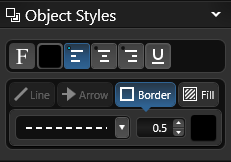
Changing Text Border Style and Size: The text border style may be changed by selecting a different border style from the drop-down menu and setting the size. If you do not wish to have a border, select None from the drop-down menu.
Changing Border Color: The border color may be changed by single left clicking the Color Square located to the right of the Border Style drop down box.
Changing Fill Style: Different fill patterns for shapes may be selected from the Fill Pattern drop down box. To choose no fill pattern for a shape, select Blank from the Fill Style drop down box.
Changing Fill Pattern Color: The fill pattern color may be changed by single left clicking the Color Square located to the right of the Fill Style drop down box.
Object Settings
The Object Tab only affects selected lines or objects.
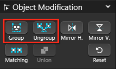 Group: Selected lines or objects will be grouped together. These lines or objects will now behave as a single object. Grouping lines or objects will make them easier to move.
Ungroup: A selected group will be broken back into individual objects. If the group is composed of smaller groups it will be broken back into the smaller groups. These once grouped objects will now be individual.
If an object has a fill pattern and is ungrouped, the fill pattern will be lost.
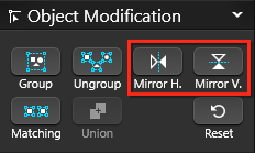 Mirror Horizontally: The selected object will be mirrored horizontally.
Mirror Vertically: The selected object will be mirrored vertically.
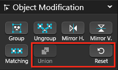
Select Matching: Pressing this button will select all objects in the design that match the currently selected object.
Union: Selected overlapping shapes will be joined together. The shapes will become a single shape.
Reset: Pressing this button will reset the size and orientation of an object that has been rotated or scaled. This will undo all changes and set the object back to its original orientation.
Visual Stacks
How objects and lines are stacked determines how they will display when they overlap. In Design Stages, you can select an object that is hidden underneath another object. In the Construction Page Layout Stage, you can only select the top most object or line.
NOTE: If you are unable to select an object or line because it is below another, you must select the object or line that is on top and move it below the object or line you want.
Object Settings of the panel has four buttons for use in stacking your objects and lines. They allow you to alter the stacking order of overlapping objects. These buttons are only active when you have an object or line in your design selected:
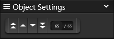
Double Up Arrows: Move selected object or line to top of visual stack.
Up Arrow: Move selected object or line up one position in visual stack.
Down Arrow: Move selected object or line down one position in the visual stack.
Double Down Arrow: Move selected object or line to bottom of visual stack.
Adding Text
New Text elements may be added to the 2D Viewport by using the Text Tool in the Panel.
Text that you have created or inserted from the Library may be edited by double left clicking.
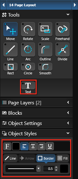
Changing Text Font: The text font and font size may be changed by single left clicking the Font button.
Changing Text Color: The text color may be changed by single left clicking the Color Square located to the right of the Font button.
Align Tools: The text may be aligned left, center or right by single left clicking one of the Align buttons . By default, text will align left.
U: The text may be underlined by single left clicking the U button.
Label Text: Selecting label text will create form style text with lines for information. The information label will appear on the left and lines for information will appear to the right. Double left-click “Label” to enter your own label. Double left-click the first line to type information. Press Enter to move to the next line.
Label Underline: Selecting label underline will add or remove the underline to the right of the label text.
Changing Text Border Style and Size: The text border style may be changed by selecting a different border style from the drop-down menu and setting the size. If you do not wish to have a text border, select None from the drop-down menu.
Changing Text Border Color: The text border color may be changed by single left clicking the Color Square located to the right of the Border Style drop-down menu.
Add Call-Out Arrow: Selecting Add Call-Out Arrow will add an arrow to the text. With the move tool, the arrow may be adjusted to point to any location in the viewport. The center point of the arrow may also be adjusted to make it bend. You can add multiple callout arrows to each text box.
Changing Callout Text Arrow Style and Size: The Callout Text arrow style may be changed by selecting a different arrow style from the drop-down menu and setting the size.
Creating and Saving New Symbols
You can create new symbols Construction but ideally you will want to create and save Symbols in Design Stages. New Symbols may be created using the line, arc, and other tools to draw complete and incomplete shapes.
You can also save new symbols to the Construction Library for future use. The buttons located at the bottom of the Library allow you to save, edit and delete custom symbols.
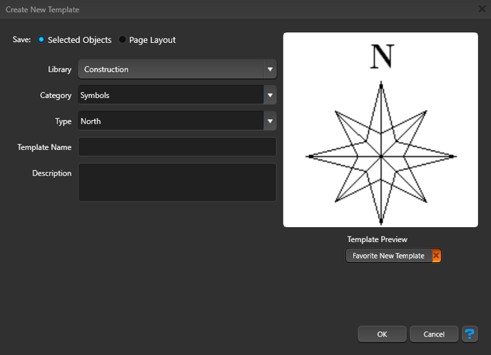
Save: With the custom symbol selected, press the Save button. The Create New Template box will come up and display a preview image of your symbol. You select the Category and Type you would like the symbol saved to from the drop-down lists and give your symbol a Name. Please note, it is very important that you choose “Selected Objects” at the top. You may also enter a Description and Search Tags for the symbol. Press the Ok button when done.
Adding Symbols from the Library
Symbols from the Construction Library may be added to the 2D Viewport.
In the Library, select the Symbols Category. A list of symbols will appear in the List View and a preview of the selected symbols will appear in the Thumbnails Panel.
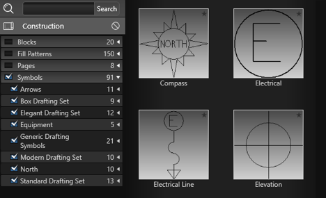
Symbols from the list may be inserted by double left clicking on the name or preview picture or using the Insert One or Insert buttons.
Surveys and Plot Plans as Background Images
You can insert background images from Stage 1: Project Information.
This is especially useful when a survey or plot plan must appear on a construction plan to meet permit requirements.
Background Images: Background Images you have inserted in previous stages will also appear in the Construction Page Layout Stage. The image will appear with your design in any 2D View you create. It will retain the same scale you set it to in the previous stages.
Each project has the option to include up to four background images. Once you insert a background image, it becomes a part of your project. You can easily control whether to hide or display these background images in the 2D View Settings.
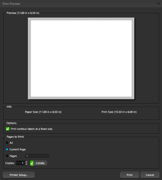
Printing in Construction
Selecting Print from the Application Menu will bring up the Print Preview box showing the current view of the selected page.
Your Paper size will automatically be the same size of your virtual paper in your 2D space. If you need to print to a larger size paper, you will need to change your virtual paper size first.
From the print preview box you may choose Print to complete your printing or Printer Setup to change printer. Remember that each page of the plan must be printed separately.
Exporting in Construction
Selecting Export from the Application Menu will bring up the Export Options.
2D Image: Selecting 2D Image from the Application Menu under Export will bring up the Save 2D Image box showing the current view of the selected page. From this box you may save the current view as a graphic file in the .jpg format. Remember that each page of the plan must be exported separately.
PDF: Selecting PDF from the Application Menu under Export will bring up the save .pdf box. Choose your desired location and press save. Remember that each page of the plan must be exported separately.
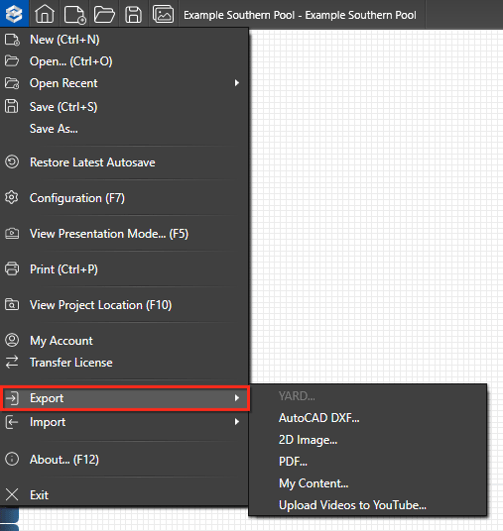
AutoCAD DXF: Plans created in the Construction Stage cannot be exported to a .dxf format. Since this option is not available, it is grayed out and may not be selected.
This option is available in the Designs Stages and may be selected there.